The Base Salary Graph (or the Incentive Graph or Total Cash Graph) is a graphical representation of the salary table displayed and is only valid for individual jobs. When the table in use is Benchmark List or Survey & Proxy Analyses, the graph will reflect data for the job/area on the salary table that is highlighted or most recently selected.
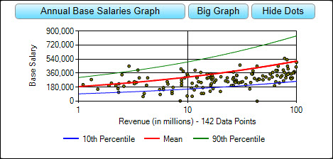
The Base Salary Graph profiles a job so the user can, at a glance, understand how a salary continuously changes as the organization size changes. The top curve represents "range maximum" salaries, the middle represents "mean" or "median" salaries, and the bottom curve represents "range minimum" salaries. These trend lines describe a database that combines publicly available data (e.g. SEC data for US areas) with a distillation of data from salary survey sources. See Data Background FAQ #1 for more information.
Please note, the dots on the Base Salary Graph in the Survey & Proxy Analyses tab represent real organizations for which source proxy data (for US areas), information circular data (for Canada), or annual report data (for UK/Europe areas) are available for download. The number of companies displayed in the graph is determined by the geographic area, industry, and organization size (e.g., revenue) selected in the Salary Adjustments dialog and may be limited by the number of public records currently available. Trend lines will appear on the Base Salary Graph in the Survey & Proxy Analyses tab even when there is a sparse population of dots displayed.
Please Note: The organization size (e.g., revenue) selected in the Refine List window does not affect the organization size selected in the Salary Adjustments dialog or the dots displayed on the graph.
To View Proxy Data Points
From the Individual Profile or Survey & Proxy Analyses table, click the Show Dots button above the graph. To de-select, click the Hide Dots button.
To View a Larger Version of the Graph
From the Individual Profile or Survey & Proxy Analyses table, click the Big Graph button above the graph. To return to the Small Graph, close the Big Graph window OR click OK.
View Data Point Details
In the Survey & Proxy Analyses screen, place your cursor over a dot on the graph to display the company name.
View Summary Compensation Tables
In the Survey & Proxy Analyses screen, click on a graph dot to load the summary compensation table.
Please note: ERI reports values as published in a proxy; if further analysis or further information about a particular company is required/desired, the subscriber needs to refer to the respective proxy of each individual company. See Refine List to download source documents.
To Edit the Y-Axis
| 1. | Click the Annual Base Salaries Graph button. |
| 2. | Select Show Values on Y-Axis | Mean/Median, Range Maximum, Range Minimum, Default Values, or Fit All Graphs. |
To Edit the X-Axis
| 1. | Click the Annual Base Salaries Graph button. |
| 2. | Select Customize X-Axis Values. |
| 3. | In the Customize Table dialog box, you must have at least three values displayed, and you can enter any number that falls in between (or includes) the range minimum and range maximum shown. |
| 4. | When you are finished entering/deleting values, click the OK button. |
| 5. | Once again, click the Annual Base Salaries Graph button. |
| 6. | Make sure that Show Customized X-Axis is checked. If it is not, select it. |
Logarithmic X-Axis
By default, the X-Axis of the Base Salary Graph is setup as a logarithmic axis. That is, X-Axis numbers are evenly spaced along the bottom of the graph, as opposed to being set on the axis according to scale. This allows for a cleaner looking graph.
To De-Select the Logarithmic X-Axis
| 1. | Click the Annual Base Salaries Graph button. |
| 2. | Select Use Logarithmic X-Axis so that it is not checked (only available for executive position titles). |
For definitions of terms, please see the Online Business Glossary and the XA Methodology.